
seaborn is a Python graphing library which interacts incredibly well with pandas. Yes, pandas does have its own plotting functions accessible from df.plot, which are particularly easy to build and (quite conveniently) don’t require another external library. I’ve fond pandas‘ plots particularly useful to do quick checks and calculations while doing some other aspect of data anaylsis — how much utility there is in a quick graph! However, once any sort of complexity enters the picture, or any need to export the plot for sharing with others, then I start to reach for seaborn. Not only is its interface with pandas seemless, it provides simple interfaces to more complex statistical plots, contains a number of attractive themes/palettes, and generally looks nicer.
seaborn focuses on have a common interface for creating its plots: xplot(data=df, x='column_name1', y='column_name2', hue='column_name3'), and having them by default look attractive. seaborn is matplotlib-based, so it is infinitely customizable (as are pandas plots, etc.).
Long Datasets
For most of the examples, I’m going to use built-in seaborn datasets, however, one thing to be aware of is that seaborn prefers long data, and I regularly convert datasets into this format when getting ready to use seaborn for analysis. This is not always clear from the built-in examples which are already int his format, so let me provide an example. (There may be a way to utilize it with wide datasets…)
For example, I recently was comparing the performance of a handful of NLP tools on an NER task. Since I lacked a gold standard, I calculated the jaccard coefficients between them. My table looked like this (though with quite a few additional comparisons):
| note_id | ctakes_mml | ctakes_mm | mml_mm |
| 1 | 0.79 | 0.69 | 0.9 |
| 2 | 1 | 1 | 1 |
| 3 | 0.5 | 0.5 | 1 |
This format was quite natural as I was constructing it, however, seaborn prefers a different view which is calculable using pandas.melt (or df.melt).
import pandas as pd
import seaborn as sns

df = pd.DataFrame(
    {'note_id': [1, 2, 3],
     'ctakes_mml': [0.79, 1, 0.5],
     'ctakes_mm': [0.69, 1, 0.5],
     'mml_mm': [0.5, 0.5, 1]}
)

df = df.melt(
    id_vars=['note_id'],
    value_vars=['ctakes_mml', 'ctakes_mm', 'mml_mm'],
    var_name='comparison',
    value_name='score',
)

print(df.to_markdown())
|    |   note_id | comparison   |   score |
|---:|----------:|:-------------|--------:|
|  0 |         1 | ctakes_mml   |    0.79 |
|  1 |         2 | ctakes_mml   |    1    |
|  2 |         3 | ctakes_mml   |    0.5  |
|  3 |         1 | ctakes_mm    |    0.69 |
|  4 |         2 | ctakes_mm    |    1    |
|  5 |         3 | ctakes_mm    |    0.5  |
|  6 |         1 | mml_mm       |    0.5  |
|  7 |         2 | mml_mm       |    0.5  |
|  8 |         3 | mml_mm       |    1    |

ax = sns.violinplot(data=df, x='comparison', y='score')
ax.figure.savefig('comparison.png')  # save to file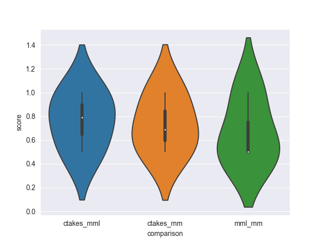
It may even make sense to break apart the comparison column into left and right which might allow simple use of sns.heatmap (yes, this example is a bit mroe complicated)
df['left'] = df.comparison.str.split('_').str[0]
df['right'] = df.comparison.str.split('_').str[-1]
# group by left/right, and pivot
hm_df = df.groupby(['left', 'right'])['score'].mean().reset_index().pivot(index='left', columns='right', values='score')
print(hm_df.to_markdown())
| left   |       mm |        mml |
|:-------|---------:|-----------:|
| ctakes | 0.73     |   0.763333 |
| mml    | 0.666667 | nan        |

ax = sns.heatmap(hm_df)
ax.figure.savefig('heatmap.png')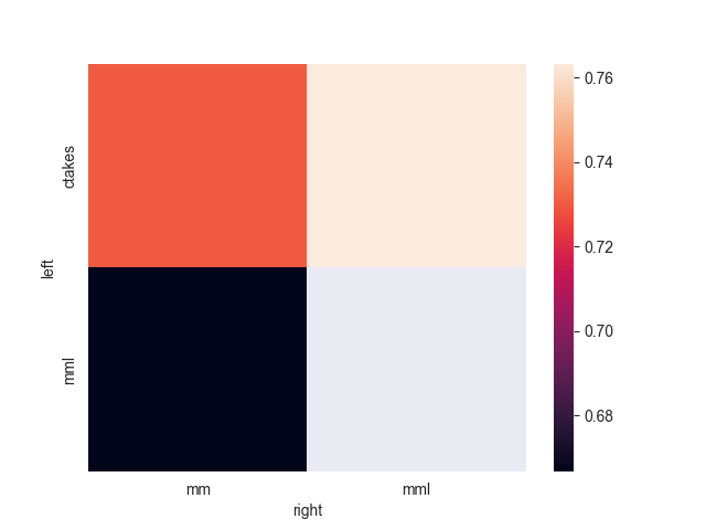
Tips Example
Perhaps the easiest approach to demonstrating the diversity of applications for a single dataset is to use one of the built-ins:
import seaborn as sns
tips = sns.load_dataset('tips')
tips.head()
| | total_bill | tip | sex | smoker | day | time | size |
|---:|-------------:|------:|:-------|:---------|:------|:-------|-------:|
| 0 | 16.99 | 1.01 | Female | No | Sun | Dinner | 2 |
| 1 | 10.34 | 1.66 | Male | No | Sun | Dinner | 3 |
| 2 | 21.01 | 3.5 | Male | No | Sun | Dinner | 3 |
| 3 | 23.68 | 3.31 | Male | No | Sun | Dinner | 2 |
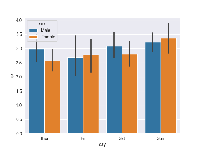
| 4 | 24.59 | 3.61 | Female | No | Sun | Dinner | 4 |Let’s pick ‘tip’ as our x-axis, ‘day’ as our y-axis, and ‘sex’ as our hue. (The idea of hue is a unit to compare y (think a multi or stacked bar chart). Note that we are picking to look at a categorical x (day of the week), a numeric y (tip), and a categorical hue (I think hues are always interpreted as categorical).
sns.boxplot(tips, x='day', y='tip', hue='sex')
sns.barplot(tips, x='day', y='tip', hue='sex')
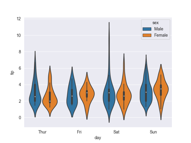
sns.violinplot(tips, x='day', y='tip', hue='sex')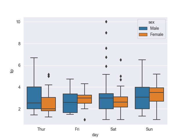
To make these vertical, we can simply swap x and y:
sns.boxplot(tips, y='day', x='tip', hue='sex')
sns.barplot(tips, y='day', x='tip', hue='sex')
sns.violinplot(tips, y='day', x='tip', hue='sex')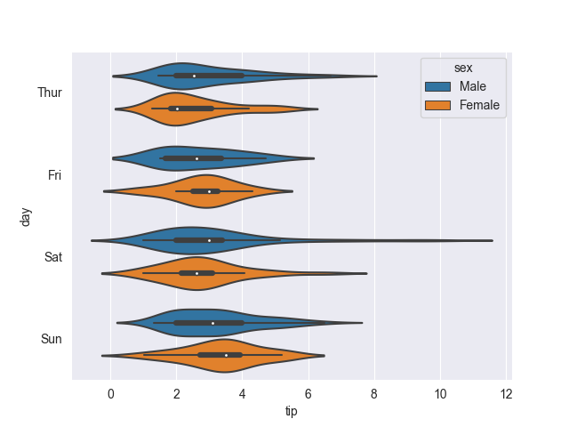
Changing the colors is easy by using a pre-defined color palette by specifying the palette name as a string. Let’s change our plot to a day-of-the-week hue to explore more colors:
sns.violinplot(tips, x='sex', y='tip', hue='day', palette='husl')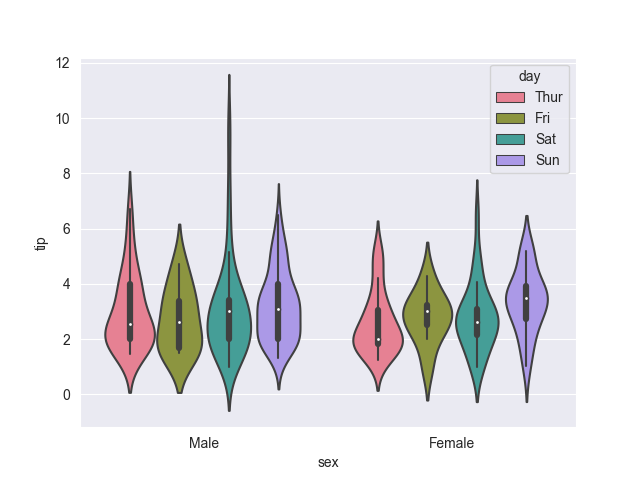
Using numeric data provides options for other charts. E.g., the jointplot is all calculated from the same dataframe:
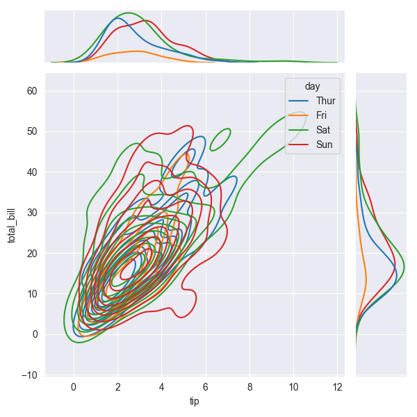
sns.jointplot(tips, x='tip', y='total_bill', hue='day')
sns.jointplot(tips, x='tip', y='total_bill', hue='day', kind='kde')
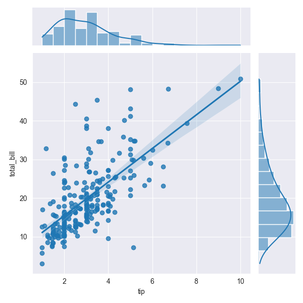
sns.jointplot(tips, x='tip', y='total_bill', kind='reg') # currently, doesn't support hue
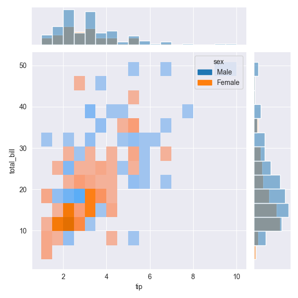
sns.jointplot(tips, x='tip', y='total_bill', hue='sex', kind='hist')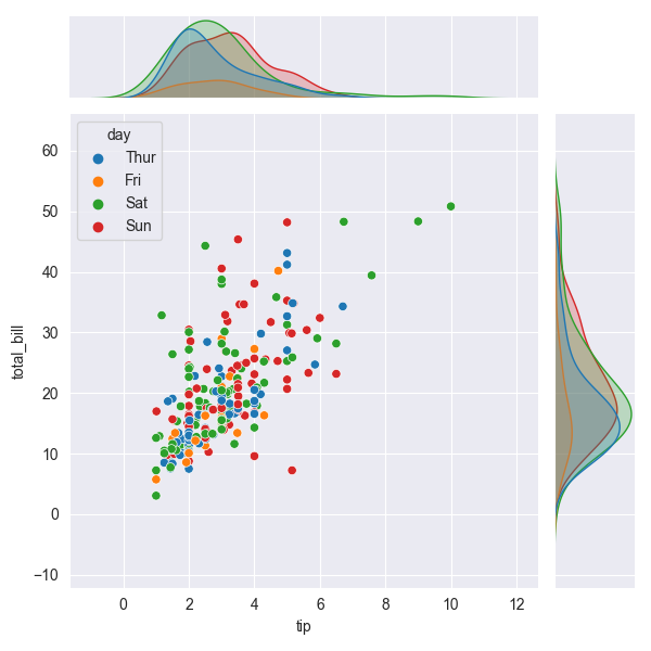
Conclusion
The best way to get started is to try using your own data. Use df.melt if your data is wide rather than long, and enjoy experimenting. The seaborn documentaton includes pages of beautiful examples and excellent documentation.